Plotting with Matplotlib
Matplotlib is a powerful plotting library within Python. Here I show examples of how to prepare three different plot types using Python’s Matplotlib. To learn about reading in data from a file, please see this earlier post.
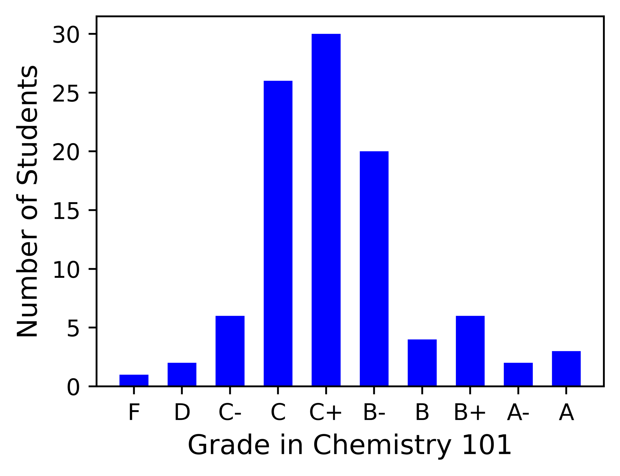
1. Bar Chart
Suppose you wanted to report the breakdown of student course grades in Chemistry 101. A bar chart showing Number of Students vs. Letter Grade is one way to convey this information.
----------------------------------------------------
import matplotlib.pyplot as plt

#Data to plot
grades = ['F','D','C-','C','C+','B-','B','B+','A-','A']
Nstudents = [1,2,6,26,30,20,4,6,2,3]

#Bar chart
fig = plt.figure(figsize = (4, 3), dpi = 700)
plt.bar(grades, Nstudents, color='blue', width = 0.6)
plt.xlabel("Grade in Chemistry 101", fontsize = 12)
plt.ylabel("Number of Students", fontsize = 12)

plt.show()
----------------------------------------------------
Now suppose instead, that you wanted to compare the breakdown of student course grades in two different groups of Chemistry 101 students. The bar chart can be modified slightly to compare the scores of ‘Group A’ and ‘Group B’ students.
----------------------------------------------------
import matplotlib.pyplot as plt

#Data to plot
grades = ['F','D','C-','C','C+','B-','B','B+','A-','A']
Group_A = [1,2,6,26,30,20,4,6,2,3]
Group_B = [1,1,6,18,25,24,11,7,6,1]

#Bar chart with two sets of data
x = np.arange(len(grades))
w = 0.4
fig, ax = plt.subplots(figsize = (4, 3), dpi=700)
A = ax.bar(x - w/2, Group_A, w, color='blue', label='Group A')
B = ax.bar(x + w/2, Group_B, w, color='magenta', label='Group B')
ax.set_xlabel('Grade in Chemistry 101', fontsize = 12)
ax.set_ylabel('Number of Students', fontsize = 12)
ax.set_xticks(x)
ax.set_xticklabels(grades)
ax.legend()

plt.show()
----------------------------------------------------
2. Scatter Plot
The daily high temperature in Washington DC was recorded for every day in the month of January. These data are shown in a scatter plot.
----------------------------------------------------
import numpy as np
import matplotlib.pyplot as plt

#Data to plot
day = np.arange(1,32,1)
temp = np.array([41,58,44,47,43,44,48,39,48,50,44,49,51,56,53,49,49,48,53,46,55,52,39,38,39,38,45,37,33,40,34])

#Scatter plot
fig = plt.figure(figsize = (4, 3), dpi=700)
plt.scatter(day, temp, marker='^', color='purple')
plt.xticks(np.arange(1,32,6))
plt.xlabel("Day", fontsize = 12)
plt.yticks(np.arange(30,61,5))
plt.ylabel("Temperature (°F)", fontsize = 12)

plt.show()
----------------------------------------------------
3. Line Plot
Now let’s try plotting a function. This piece of code generates the data we need for a line plot of a quartic polynomial.
----------------------------------------------------
import numpy as np
import matplotlib.pyplot as plt

#Function to plot over chosen range of x values
x = np.linspace(-2,4,100)
y = x**4 -4*x**3 - x**2 + 10*x

#Line plot
fig = plt.figure(figsize = (4, 3), dpi=700)
x = np.linspace(-2,4,100)
y = x**4 -4*x**3 - x**2 + 10*x
plt.plot(x,y,color='#6a5acd', linewidth=4)
plt.text(0,8,'$y=x^4 - 4x^3 + x^2 + 10x$', fontsize=8)
plt.xlabel("x", fontsize = 12)
plt.ylabel("y", fontsize = 12)

plt.show()
----------------------------------------------------